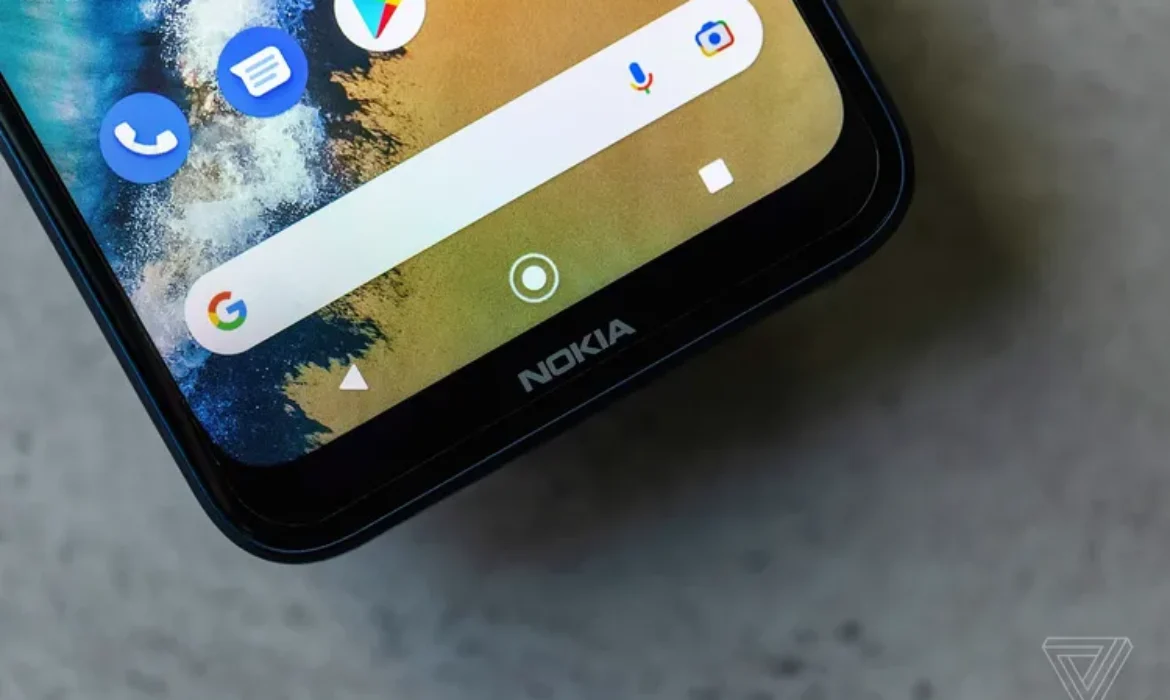
Finnish 5G equipment manufacturer Nokia unveiled a new logo to move away from the image of a mobile device manufacturer.
The new brand identity includes five shapes that form the word NOKIA, in different colors depending on the use case.
The company’s iconic blue has been replaced to symbolize its repositioning as a “business technology company” rather than a cell phone manufacturer.
The last time the company substantially updated its logo was in the late 1960s, when the famous blue-printed Nokia logo debuted.
According to the press release, the new design is meant to represent “an active, dynamic and modern Nokia,” reflecting the company’s core values and goals.
“It was designed as a symbol of the collaboration that Nokia believes is critical to realizing the exponential potential of networks: unlocking advances in sustainability, performance and accessibility,” the statement said.
CEO Pekka Lundmark discussed the reasons for the rebranding, saying, “In most people’s opinion, we are still a successful cell phone brand, but that’s not what Nokia is about. We want to launch a new brand that focuses on networks and industrial digitalization, which is completely different from the outdated cell phones.”
The departure from Nokia’s previous identity as a phone manufacturer will be further demonstrated at this year’s Mobile World Congress in Barcelona.
Nokia’s new logo symbolizes the company’s evolution towards the future and its efforts to distance itself from its past as a cell phone manufacturer. It symbolizes Nokia’s new commitment to collaboration, technological innovation and unlocking the potential of networks.


